Warning from Google Webmaster Tools: Fix Mobile Usability Issues or Risk Lower Search Rank
3 min read
February 26, 2015
Did you recently receive a startling email from Google Webmaster Tools? If your website hasn't yet been updated to accommodate mobile phones, it's likely that you did. As of last month, Google has been dispatching forewarnings of impending doom to the owners of any website not yet 100% optimized for use on these devices. In case you haven't received one of these emails, we've included one below: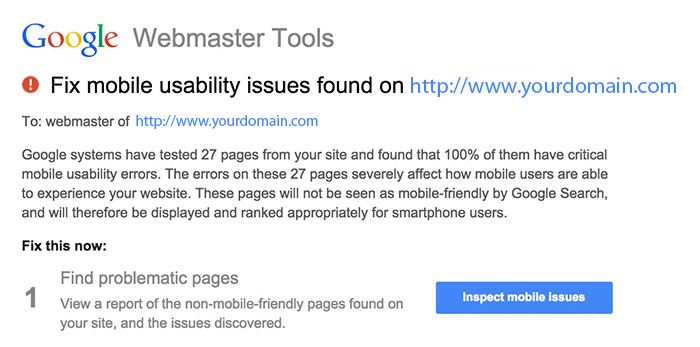
Why the Warnings?
These ominous emails weren't sent for no reason - Google always has a method to its madness! According to the head of Google's Webspam team, Matt Cutts, in the past year, the number of mobile search queries has finally surpassed the number of desktop or laptop queries. Since one of Google's main goals has always been to improve user experience, this fact means proper functionality on mobile devices is now more necessary than ever.However, Google Webmaster Tools' push towards mobile optimization shouldn't come as too big of a surprise, especially since Google has been hinting at it for a long while. Early last year, for example, it began penalizing mobile sites for including flash elements, since flash often increases mobile website loading time. Also, last November, Google posted on its blog offering guidance on how to enhance mobile website usability and which website components should be given special attention. Google then announced that a related algorithm update could potentially be looming in the near horizon.
What Should You Do?
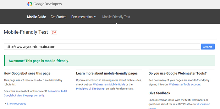
To update your mobile website in accordance with the alert from Google Webmaster Tools, we suggest you start by determining where its issues lie. To do so, you can use Google Webmaster Tools' Mobile-Friendly Test Tool. As its name suggests, this examines how well your website runs on a mobile phone, and then gives it either a passing or failing grade. However, if you received the warning email, you can skip this test because you already know which grade you will be given.Next, we recommend you use Google's Mobile Usability feature to generate a report outlining which specific areas of your website need to be updated. Some errors it may tell you to fix pertain to having flash content on your site, using fonts that are too small, or having placed clickable links too close to each other.
Ultimately, you need to receive both a passing grade on the Mobile-Friendly Test as well as a Mobile Usability report indicating your mobile site has no errors from a usability perspective. The best way to make this happen is with a responsive web design.
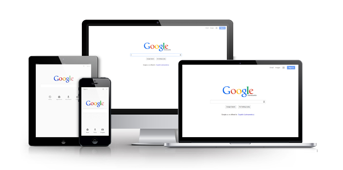
Responsive Web Design
A responsive web design is built to contain every mobile usability element Google is looking for while also being able to function optimally on a desktop, laptop, or tablet. Although phones, tablets, and computer screens are all different sizes, a responsive web design enables your website to detect which device it's being accessed from, and then to adapt itself to fit the screen accordingly. Also, a responsive web design makes webpages easy to navigate and read on a mobile device because it allows the text to be clear and legible without you needing to zoom in. In addition, the increased fluidity and sleekness of a responsive web design adds a more appealing, professional touch, which will make your website more appealing to visitors.
The Perfect Solution
While you might be worried by the warning email you received from Google, you can relax knowing you're website is not yet doomed. You have until April 21st to fix any usability issues, and WebFindYou can help. Our next generation responsive web designs intrinsically include fully SEO optimized HTML, JavaScript, and CSS code, in addition to every other technicality required for your site to be Google-approved. Further, for a faster, more cost-effective solution, our responsive predesigns are ideal since the design structure is already ready-to-go, so all that needs to be done is to customize it to align with your company's own corporate identity, such as by adjusting the graphical elements, such as color scheme and logo, and by modifying the text to reflect the products and services you offer. As opposed to other companies who will typically take months to design a responsive website for you, charge a high price for it, and require you to pay a separate fee to have it optimized for search, our predesigns are ready to go in a fraction of the time, at a fraction of the cost, and are all built to maximize your potential visibility in search results. Which sounds like a better choice? We'll let you be the judge of that. The important thing is that you heed Google's advice by taking action right away!
Don't let your website's visibility in mobile search results be affected by Google's update! If you need help optimizing your website, don't hesitate to contact us.
Don't Miss These Other Must Read Articles


")


