Google's New Core Web Vitals: Everything You Need to Know to Help Your SEO and Conversions
- Every SEO'er and Their Grandma Is Talking About It
- Where Were We With Google Updates?
- Google Search Team and Chrome's Web Dev Team Collide
- Keep These Page Experience Signals in Mind
- Which Type of Data Does Google Care About?
- Largest Contentful Paint Explained
- Evaluating LCP Scores
- Optimizing Your LCP Score
- More Contributing Factors For Poor LCP Scores
- Client-Side Versus Server-Side Rendering
- Get Acquainted With First Input Delay
- Room to Improve Your FID Score
- Third-Party Script Issues
- Understanding Cumulative Layout Shift
- Calculating CLS Scores
- Optimizing for Better CLS Scores
- Image Dimensions and Their Aspect Ratios
- It Gets Tricky With Responsive Images
- What About Ads, Embeds and Iframes Without Dimensions?
- Make Space for Embeds and Iframes
- Avoiding FOUT or FOIT
- Self-Hosting Fonts
- Preloading Fonts
- Font Display, Variable Font Files and Subsetting
- Shifts Aren't Always Bad When Users Expect It
- Get Under The Hood of Your Website Using Developer Tools
- Websites With WebFindYou Always Score Green
- Google's Vision for a Better Web Experience
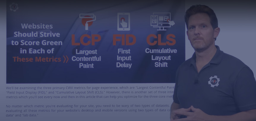 Quick Explanation Video

Every SEO'er and Their Grandma Is Talking About It
It's that time of year again when Google is set to go live with another major core update. And it might drive some SEO specialists off the edge of their seats come June 2021. The update was supposed to drop on the first of May, but Google has pushed their update back to give people some time to prepare.Launching broad core updates has become a standard every few months or so ever since Google released their major BERT update on October 21st, 2019.
Since then, Google has decided to be more transparent and communicative about its broad core updates. Their Google Search Central Blog is a great resource to refer to.
You'll find out news and information about upcoming changes and updates, and they even provide community FAQs about their core updates to help those who live and breathe SEO be in the know.
Early in 2020, Google announced a new update that's a combination of a few conceptswe'll dive deeper into that shortly. But in a nutshell, they're rewarding websites that offer the best user experience based on Google's Core Web Vitals (CWV) metrics that measure a site's layout stability, speed of displaying content, and how well and fast it can become interactive.
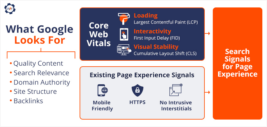 They'll be combining CWV with their existing page experience signals, which are mobile usability, resolving security issues, favoring secure sites using an SSL certificate, and sites with intrusive ad experiences or ones that draw attention away from the site's main content will be flagged as having a poor user experience.
There's even more to this update. Google News will now support non-Accelerated Mobile Pages (AMP) and remove the AMP badge for AMP-based content.
Google has been focusing on quality content and page experience for years now, ever since they started their Search Quality Rating Program, for website experience raters to follow Google's guide and base their review.
Google's "Search Quality Raters" are real people who evaluate their experiences with a website on desktop and mobile versions.
They also assess and evaluate its content and base their review around Google's "Expertise, Authoritativeness, and Trustworthiness" (E-A-T) concept. Keep this concept in mind as we move on. This upcoming update is really about looking under the hood of your site to fix performance issues while also providing fresh quality content.
 Google learned a lot throughout the pandemic about how people searched and worked to improve their products behind the curtains ever since. However, the uncertainty of what's to come has prompted Google to answer many questions that SEO specialists, marketers, and programmers have about the upcoming rollout of their CWV update.
Google has provided two FAQs for those interested and you can read the first December 2020 FAQ and the latest March 2021 FAQ to get caught up.
Google updates have always stressed out some SEO specialists, programmers, marketers, and web admins. Every update by Google could signal changes to an article's or website's ranking position.
It's always a possibility with Google, but if you follow these key guidelines that Google released, then there shouldn't be anything to worry about.
But, if your site or content ignores what Google is looking for, or you're not sure, then you might want to stick around.
Where Were We With Google Updates?
Flashback to 2019. Google just announced a significant change to its search algorithms with the launch of its mouthful of a name, the "Bidirectional Encoder Representations from Transformers" (BERT) update.The update, introduced in 2018, was an open-sourced project that tied the relationship and interaction of computers to the natural language spoken by humans. BERT was about understanding and contextualizing the language of search queries through a computer science subfield called Natural Language Processing (NLP).
Google improved its search engine and its ability to understand complex or conversational queries by taking into account all the nouns, verbs, prepositions, and the whole context of a searcher's intent within their query. Through machine learning and using a neural network-based technique for NLP pre-training, they were able to make landmark changes to their search engine.
Although the BERT update was a big deal, since then, Google has been consistently launching core updates to improve search results and rewarding those who provide great content, seamless user experiences across devices and Google favors those with secure websites that perform excellently.
Google has given us a great example of how to interpret what a core update is all about and here's what they said as it relates to content:
The list will change, and films previously higher on the list that move down aren't bad. There are simply more deserving films that are coming before them.
Google states that most core updates aren't noticeable enough to affect your site's ranking. However, if they do claim to release an update that'll dramatically affect your site's rank, then they'll release information and give notice of when those changes are to occur in advance, which allows web admins, content creators, site owners, etc., to take action.
And so, on January 13th, 2020, Danny Sullivan, a Public Liaison for Search, tweeted that an update was about to be released and told everyone to follow the same advice they've been given on all of their other broad core updates.
Later today, we are releasing a broad core algorithm update, as we do several times per year. It is called the January 2020 Core Update. Our guidance about such updates remains as we've covered before. Please see this blog post for more about that:https://t.co/e5ZQUA3RC6
— Google SearchLiaison (@searchliaison) January 13, 2020
This announcement and their release of core updates throughout 2020 were precursors for what's to come in June. So here's what you need to know.
Google Search Team and Chrome's Web Dev Team Collide
As we mentioned earlier, in May of 2020, a blog post by Google's Chrome Development Team announced the launch of their Core Web Vitals program to set the official metrics for websites as it relates to their speed, responsiveness, and visual stability. In parallel, the Google Search Team will be incorporating their existing page experience signals in conjunction with the Core Web Vitals rollout.In that same blog post, they mentioned that they'd be including page experience metrics for their "Top Stories" search feature for mobile users, and they'll be removing the AMP requirement (they're still supporting AMP) for those who want their content to be featured on the Top Stories list as well.
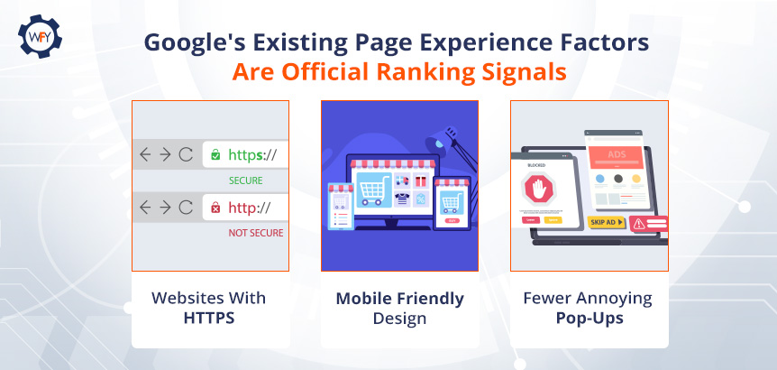
Google's existing page experience factors are mobile-friendly sites, sites following safe browsing protocols, secure sites using an SSL certificate, and guidelines for sites using pop-ups (interstitials). Review those existing page experience factors as a guide.
Note: On August 4th, 2021, Google removed the "safe browsing" protocol as a ranking factor because site owners shouldn't be held responsible for third-party cyberattacks or hijacking.
 Google also updated its Lighthouse tool and PageSpeed Insight tool to help site owners improve their website with constructive data based on the CWV metrics.
Google reinforced that page experience is an important quality ranking signal, but they will still give priority over pages with content that has the highest quality of information even if the page experience isn't that great.
So what is this core update bringing to the table that you should know about?
Keep These Page Experience Signals in Mind
To reiterate here, Google will still rank pages that hit every mark of the "E-A-T" acronym, yet page experience won't overtake quality content to a certain degree. However, you should optimize your website and its pages to Google's existing page experience signals and Core Web Vitals' three main user experience metrics.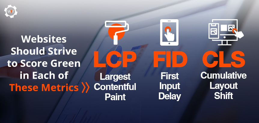 We'll be examining the three primary CWV metrics for page experience, which are "Largest Contentful Paint (LCP)," "Field Input Display (FID)," and "Cumulative Layout Shift (CLS)." However, there is another set of three interrelated metrics which you'll see every now and then in this article that can help you optimize for the three core metrics.
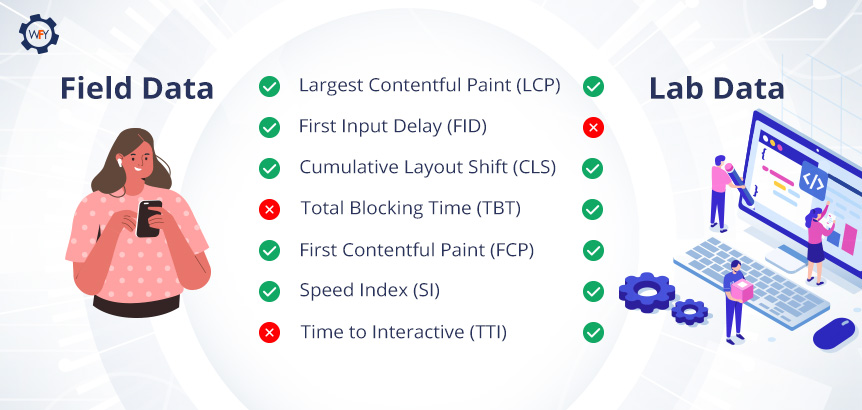
No matter which metric you're evaluating for your site, you need to be wary of two types of datasets. Google is evaluating all these metrics for your website's desktop and mobile versions using two types of data called "field data" and "lab data."
Which Type of Data Does Google Care About?
Google has provided a document that lists seven tools you can use to evaluate your website's performance and page experience based on these two types of data. But what are field and lab data results really? Field data is gathered and measured based on real human interactions and is pulled from the Chrome User Experience Report (CrUX). Whereas lab data is collected under the perfect conditions in a controlled environment, the results are pulled from a single specified device (desktop or mobile device) on a predetermined network connection and geolocation. Right now, lab data is simulated on a Moto G4 phone on a fast 3G network connection.
The PageSpeed Insights tool can collect lab data by running the Lighthouse tool, which suggests areas to improve and even diagnose performance issues and can pull field data from the CrUX report if there's enough data to do so.
Lab data is good for debugging issues by identifying, isolating, and fixing your site's issues or reproducing results.
But Google is really only focusing on what real users experience in the field (real-world) and not lab results.
Google's Developer Relations, Martin Splitt, sums up their reasoning for outweighing field data over lab data:
That's what happens because the lab data is only synthetic. It's only an approximation of what happens in the real world. And then you have field data which, surprisingly, gives you the actual thing that people are experiencing.
So if you know that you are serving users on slow, old phones. Or rural, spotty, internet connections. This is what happens. This is when the field data looks a lot worse than what you see in lab data.
That's a general problemdevelopers usually work with fantastic internet connections on modern laptops. And then the real-world user is on an old iPhone 2, somewhere in rural, northern Germany where you have an Edge internet connection if you are lucky. And then everything looks terrible for them
Field data is probably a better indicator of how real users are experiencing your website than lab data. Because lab data is literally just someone's server making a request to your thing. And then if that server happens to be quite beefy, then you get pretty good-looking numbers, but then the real world isn't as beefy and nice.
For every metric we are going to mention, this is what Google prefers, how real users interact with your website or app. And with that, we'll begin with our first metric that's critical for user experience.
Largest Contentful Paint Explained
Largest Contentful Paint (LCP) may not mean much to you just by looking at words alone, but it's a vital metric to optimize for. LCP is a user-centric based metric for the perceived time it takes for a website's page to load and how long it takes for the largest element to render and appear to the end-user.Another way to look at it is how long the page will take to load and paint (display everything) so that a user can see and start interacting with your website. Essentially, it's the perceived page loading speed that's being measured.
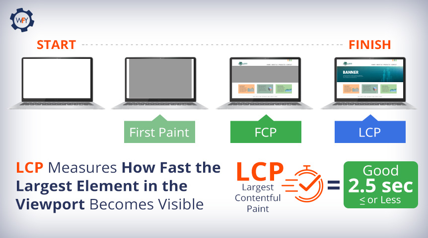 Let's say a user were to visit your homepage. The LCP metric will record the amount of time your website took in seconds to render the largest visual elements on the screen. This could be the initial loading of a banner, background image, or video banner and the loading of your page's text blocks within the viewport (screen).
This metric is only looking at the largest elements loading above the fold, which means anything that you can see as soon as you visit a web page without scrolling down. Google is not measuring what elements of your website are loading when a user scrolls down below the fold, just the initial page load.
The LCP score is available in both lab and field data results. How long LCP is measured varies. For field data, the browser will end reporting new LCP scores when the user interacts with your page, but lab data results stop being reported when the Time to Interactive (TTI) metric is complete.
To see lab data results, use Chrome DevTools, Lighthouse and webpagetest.org. For field data, use the CrUX report, PageSpeed Insights, Google Search Console, or install
web-vitals library in your JavaScript files.Evaluating LCP Scores
How fast your largest element load is, without a doubt, a critical quality signal that Google will be looking out for. That begs the question then, what's a good LCP score?Coming straight from Google's web.dev's passage titled, "What is a good LCP score?", a passing score is 2.5 seconds or less, 2.6 to 4.0 seconds needs improvement, and anything over 4 seconds is poor.
The post describes how you can statistically evaluate an overall good score, which applies to every metric mentioned. Google stated, "To ensure you're hitting this target for most of your users, a good threshold to measure is the 75th percentile of page loads, segmented across mobile and desktop devices."
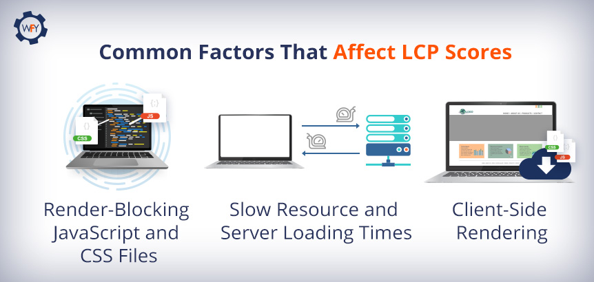 So what are the causes that contribute to websites scoring so low in the LCP metric?
Well, there are many causes for poor LCP scores, such as slow server response times (a big one), for example, unoptimized database queries that take too long to pull data from the backend of your website or its applications. Slow API call resolve times that are taking a while to look up the URL's Internet Protocol (IP) address.
Other factors that contribute to poor LCP scores are render blocked JavaScript (JS) and CSS files and massive image and video files also contribute to slow resource loading times. Last but not least, the decision of choosing how you should render your JS and CSS files, which we'll get into later.
Optimizing Your LCP Score
To optimize for a great LCP score, there are several things you can do as it relates to images and videos. The easiest thing to do is consider whether you want to keep that large image or video file and have it be the first thing that loads on your website.If you're going to keep it, then you'd want to focus on optimizing these HTML resource elements if they load above-the-fold:
img file types, image tags inside of an svg tag, the thumbnail or poster image of a video tag, background images that load using the url() function and block-level elements that utilize text nodes (the main text on web pages) or the children of inline-level text elements.Note: CSS elements such as margin, padding, or borders aren't calculated in the reporting of LCP metrics and
video and svg elements may be calculated in the score in the future.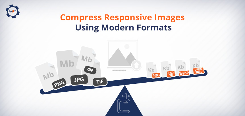 To optimize for slow loading resources, you should compress your responsive images and use better image formats such as WebP, PNG, JPEG 2000, JPEG XR, and you can experiment with the AVIF image format. Use image compression software like Minify, Imagemin, Imagify, etc. It's also recommended that you remove unused JavaScript and use tools that minify JavaScript, HTML and CSS files.
The next optimizing tip is to defer non-critical scripts or style sheets to avoid render-blocking your site's resources that are delaying how fast and early your site paints.
Experiment with preloading critical assets (resources) using the
rel="preload" for your link tags so you can pull videos, images, text, CSS styles, or JavaScript files early.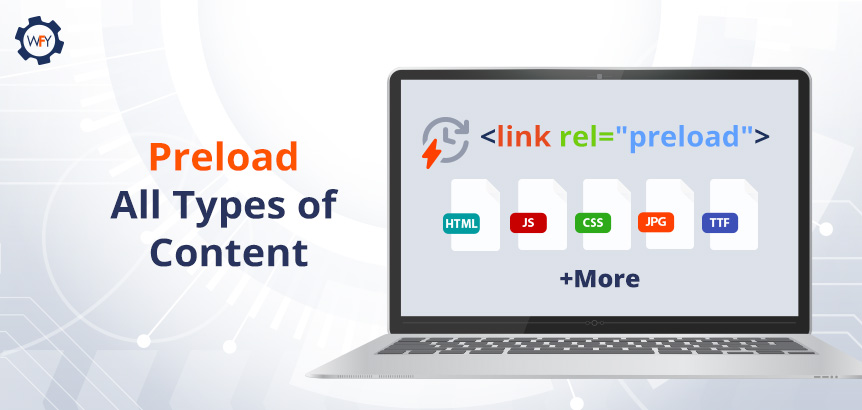 This allows the browser to load those assets first versus the browser loading these assets later because you've given these elements priority to avoid slow server response times.
Another tip to add if you're deferring your CSS files using the steps above is to inline your critical CSS files (Critical Path CSS).
You could identify the external CSS resources that load above the fold and inline them inside the
head tag within the HTML structure or your site.Luckily, there's a way to extract and inline the Critical Path CSS files to load via JavaScript using an online critical path CSS generator.
More Contributing Factors For Poor LCP Scores
Slow server response times affect the loading of any and all elements on your website. The faster a server can pull resources to deliver and paint all of your site's elements, the better your scores are for every single page-load metric such as LCP.In the Lighthouse tool, there's an audit metric called "Reduce Initial Server Response Time," and it's one of the ways you can diagnose slow server response times that may be occurring in the back-end of your site. You can also evaluate and correlate your server's response time in Lighthouse using the Time to First Byte (TTFB) metric to see where there's room for improvement.
You can improve your TTFB by optimizing your site's server, ensure that HTML pages cache first and their assets as well, establish third-party connections early on; you can implement
link, rel preload and server push techniques for some resources. Lastly, connect faraway visitors to a CDN server near them, and use an image CDN so users don't have to wait so long for your site to load and its visual elements as well.Routing your visual elements to an image CDN is actually becoming a modern web practice, according to Google's Engineering Manager Addy Osmani's "Optimize for Core Web Vitals" YouTube video.
Client-Side Versus Server-Side Rendering
Another factor that affects your LCP score is solely relying on client-side rendering. This is if your website or a single-page application uses frameworks and file libraries such as Angular, React, and Vue that have large JavaScript file bundles to execute on the browser.Client-side rendering (CSR) and even server-side rendering (SSR) are some of those decisions you'd have to consider for your website, and its applications, if any, and you might have to use a hybrid approach depending on what vertical your website is about and what you're trying to accomplish.
You can use an SSR approach for things that you want Google to crawl, but if your site has an application to, let's say, order and deliver food, then use a CSR approach to shift the workload onto a user's device, browser, and network connection.
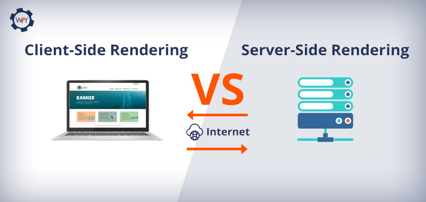 The issue with CSR is that your website and all of its functionalities that use JavaScript are being downloaded and rendered by the user's browser and network connection versus the workload being handled by your server that was built to handle so many requests and interactions.
Let's say the user visiting your site or using your app has network connection issues. They may not see any of the page's content or use an app's functionality until it finishes downloading and executing that code on the client-side.
So it's best to use a server-side rendering approach where it makes sense to, and use pre-rendering techniques for your applications and code minimizing techniques discussed above.
That was a lot to take in, right? Well, optimizing how fast your website delivers and paints content on the screen is extremely vital for the user's experience, so it's worth the programming work that's needed to help you get that LCP score in the green zone. Let's move onto the second Core Web Vitals metric.
Get Acquainted With First Input Delay
Visiting a website is like meeting someone for the first time, and your site should make a long-lasting impression so it doesn't leave your visitors with a bad experience.Yeah, having a very fast-loading beautiful website that scores high with Google's First Contentful Paint (FCP) metric is great, but it's how and what occurs when the user interacts with your site that matters when it comes to First Input Delay (FID).
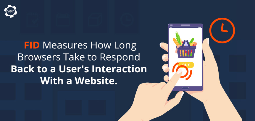 Your site needs to be interaction-ready and responsive to user inputs. Nobody wants to type in or click on an element of your website, and then something glitches or nothing happens when we interact with it, which is why FID is a vital score to do well in. FID, as described in Google's blog post, is defined as:
So how do you check your website's FID score?
It's not going to be from PageSpeed Insight tools because FID uses real user data, not lab data; however, you could look at the Total Block Time (TBT) to get a relative idea of what your FID score is.
To see your FID scores in real-time, use the Google Search Console. For lab data, use Chrome DevTools, Lighthouse, or visit webpagetest.org, where you can simulate tests with different variables such as server locations, different devices and browser versions.
What's considered a good FID score? Websites with FID scores of 100 milliseconds or less will be in the green zone since their website's code is optimized to not affect the browser's ability to read and execute JavaScript and CSS files and other web application functions.
Room to Improve Your FID Score
So what does an "alright" and "poor" score look like? An alright FID score is 100ms to 300ms and anything above 300ms is considered very poor.Poor scores result from large CSS and JavaScript codes affecting the browser's ability to parse and execute that code in time. If the browser's main thread is too busy, then it can't respond to a user's interaction on the page.
Optimizing how your scripted code parses, compiles, and executes by the browser to load a page's elements that require inputs by the user will improve your FID score.
 What else can you do after you've reduced your JavaScript files to load per page? Google suggests breaking up long, bloated JavaScript tasks into smaller and asynchronous tasks.
If a piece of code takes a browser longer than 50ms to load, it's considered a long task, so break those pieces of code up to reduce the input delay. To check if your code optimization is working, use Lighthouse's Time To Interactive (TTI) metric to gauge how long it takes for your pages to become truly interactive.
Other causes that contribute to a poor FID score for web applications are laggy long JavaScript execution times. Two other causes are render-blocking JavaScript files and large JavaScript bundle files that can delay how fast a script is processed by the browser.
To reduce long JavaScript execution times from happening, it's best to implement "lazy loading" or "progressive loading" techniques for your website's code, its visual elements, and your website's applications to help improve the speed of interactivity for your website.
Website applications that are rendered by the server-side will show pixels painted on the screen and everything on the app will appear to look fine, so the user might believe that it's working. But in reality, there might be a delay in interaction readiness for first-party script executions for your app or website.
For example, if someone is about to complete a purchase, and they get stuck, it's because large JavaScript files are blocking their interactions because it hasn't finished loading.
To optimize this, use a hybrid approach. Use client-side rendering for the application's functions but also use a server-side rendering approach for the rendering of static HTML elements that need to be painted on screen quickly.
Now what we've just mentioned here is for first-party script executions that delay the interaction readiness of your website.
There are a few more, but feel free to learn more on how first-party scripts can delay interaction readiness as we move on to how third-party scripts can delay interaction latency and readiness.
Third-Party Script Issues
You see, third-party script executions can affect and delay the interaction latency as well. Sites that use third-party tags for pop-up ads or tags for analytics make the browser's network busy and affect the browser's main thread to become periodically unresponsive.In some cases, third-party scripts override first-party scripts and are loaded at the start, which can contribute to the delay in your webpage's interactivity. Prioritize what should load first to what you think the user should see on your site.
The Core Web Vitals' article on optimizing for FID suggests, to use web workers so you can run JavaScript in the background of the main thread and moving nonessential user interface operations to a separate worker thread to reduce main thread blocking times.
They also recommend that third-party scripts should load using the
async or defer functions; you should, again, split up your JavaScript code in multiple sections and minimize unused polyfills.If you're getting stuck on how to optimize your site's FID score, and the other metrics we've mentioned, then we highly suggest that you refer to Google's web.dev articles for more detailed instructions for you or your programming team. Let's move on to the final metric that promotes a stable website layout design.
Understanding Cumulative Layout Shift
By now, you should understand that user experience is everything and we've covered how important it is for your site to load and become interactive.But what happens when a visitor lands on your site, and all of a sudden, as they interact with your website, the layout moves in a funky way, or they click on an "Add to Cart" button, but the layout shifts, and they mistakenly click "Instant Checkout." Yikes!
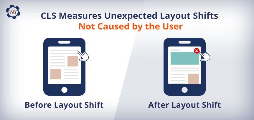 Measuring the visual stability of your website to ensure a smooth interaction is one of the final user-centric metrics we'll be discussing and understanding as it relates to Cumulative Layout Shift (CLS).
According to Chrome's Web Vitals' article and their section titled, "What is CLS?" they wrote that:
This metric is one of those areas where you want to score a 0.1 or less and compare your results across mobile and desktop devices to find the 75th percentile of page loads.
Scores slightly above 0.1 to 0.25 could be improved and anything above 0.25 is poor.
Your CLS scores will slightly affect your SEO and having a poor score is correlated to a bad user experience which is what these Core Web Vitals are all about. So how are these scores calculated and what can I do to improve them?
Calculating CLS Scores
The way that layout shift scores are calculated is through an API that can measure the layout's instability. The Layout Instability API by GitHub reports "layout-shift" entries whenever an element within your user's viewport changes its position at the start of the page load until it finishes rendering.Recently, Google updated how CLS is measured. Now it's measured within a five-second capped timeframe and they will evaluate how many window sessions have been initiated and they will be scored individually, but the end result is the sum of the individual layout shifts.
So essentially, the first window session begins with the first layout shift and it'll continue to scan your page. As it scans, session gaps will be created and labeled to separate each time a new window session is initiated to signal and count how many times a layout shift occurs in a time span of five seconds. They noted that the score is still defined by their original definition of how they calculate CLS scores.
CLS is about measuring the stability of elements. Shifting elements are known as "unstable elements." If a new element is added to the DOM (Document Object Model) or existing elements just change in size, it won't count as a layout shift unless it causes other elements to change their starting position.
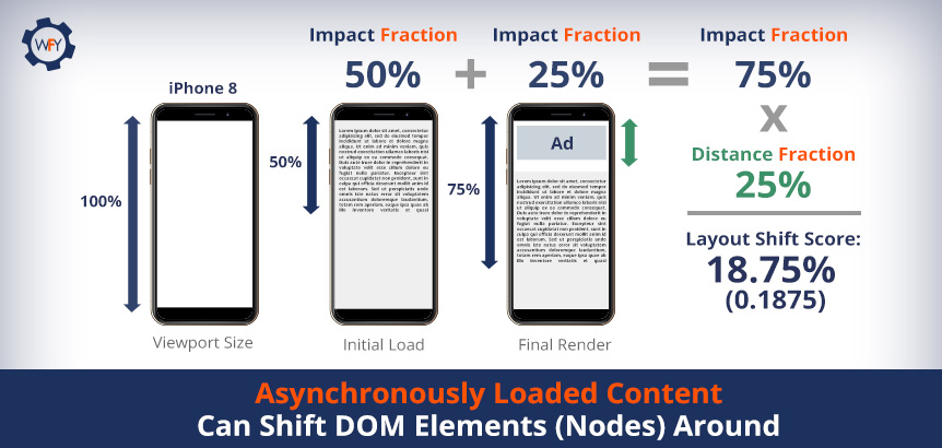 Your layout shift score is calculated within the browser. It looks at the viewport size and looks to see if unstable elements in the viewport have moved between rendered frames. Two measurements account for what your layout shift scores are.
You have the "impact fraction" dimension, which measures the effect of an unstable element and how your user would see them on their desktop or mobile devices (in the viewport). To get your impact fraction, find out what area of your website has elements loading above the fold and you divide the area of the impact region within the area of the viewport for both desktop and mobile screens.
Then there's the "distance fraction," which measures the distance of movement that unstable elements have shifted relative to the viewport, whether horizontal or vertical. To find your distance fraction, divide your viewport's height by the maximum amount of pixels that moved from start to end.
The mathematical formula to calculate CLS is to multiply the percentage of your impact fraction (percentage of the page affected, both before and after) with the distance fraction (percentage of how much of the page moves) to see the total sum of individual layout shifts. It's basically kind of like the area times the distance of how much the page moved.
Luckily, if math isn't your strong suit, you can see your CLS scores using the Lighthouse tool, Chrome DevTools (deeper insight), layoutstability.rocks, and webpagetest.org to see where you can improve your score.
Now that you know what factors are considered towards your CLS score, how can you optimize your site's visual elements for a better score? Let's find out how to optimize for it so that your website doesn't act wonky and people accidentally purchase products when they didn't mean to.
Optimizing for Better CLS Scores
The Core Web Vitals' article on optimizing for CLS dives deep into resolving common issues that result in poor CLS scores, but common causes are: images, dynamic ads, embeds and iframes without dimensions, dynamically injected content, web fonts that cause Flash of Invisible Text (FOIT) and Flash of Unstyled Text (FOUT), and when a user inputs an action and is waiting for a network response that hasn't occurred because the DOM hasn't updated yet (elements haven't loaded in time).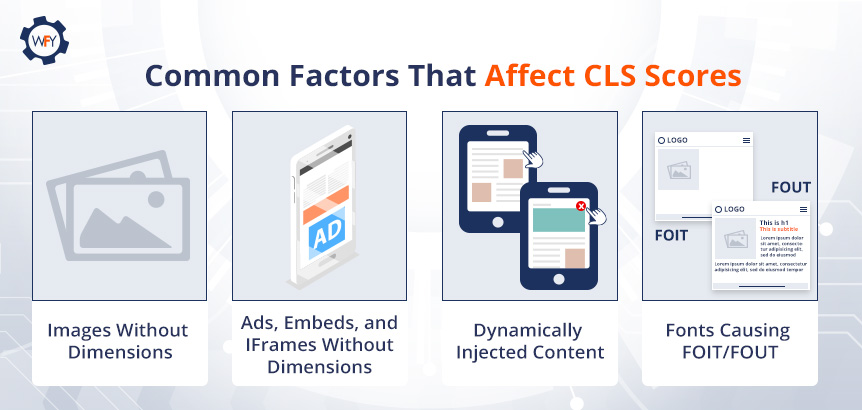 Let's start with one of the easiest things you can do to optimize an image's elements with respect to their dimensions and aspect ratios as described by the developers from Google.
Image Dimensions and Their Aspect Ratios
You're actually in luck when it comes to figuring out the aspect ratios of an image because of the way modern browsers work.The reason being is that modern browsers now set the default aspect ratio of images. They have their own user-agent stylesheets that set the default aspect ratio and all you have to do is set their dimensions, which are the
width and height attributes.This change in how modern browsers set the default aspect ratio sizes is part of the CSS Working Group and their initiative in allowing everyone to set their correct
width and height for images. What they've done is allowed browsers' stylesheets to calculate an image's aspect ratio before the image loads.It Gets Tricky With Responsive Images
This modern browser feature also works for responsive images, but there is some work involved, and there are many paths you can take to get it done.One method, suggested by the Core Web Vitals' team, is to define the
img, src, sizes, and srcset tags and just make sure that the image you're using has width and height dimensions that mirror what the aspect ratio should be.For example, an image that is 640x360 is the same as a 16:9 aspect ratio and the browser will output that ratio as long as you set the dimensions.
Determining the aspect ratios and resolution sizes across various screen sizes and how to set your
srcset and sizes are challenges that you'll have to figure out. Here's a link to see the best screen sizes for responsive design to help streamline the process.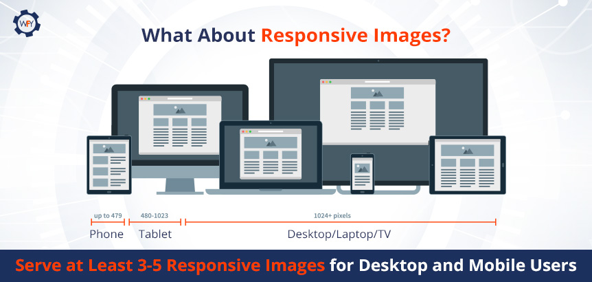 However, this browser feature doesn't work with outdated browsers, so users using outdated browsers will require you to have to place the
 src attribute as a backup because older browsers can ignore srcset and sizes attributes.Websites with WebFindYou actually use one line of code for responsive images and all a WebFindYou user has to do is upload their images onto the platform and select common devices with their respective resolution sizes. But for those who are still interested in what these attributes do, let's go over it briefly.
The
srcset tag tells the browser which image out of each set of images to choose from and what resolution size to use, whether it's for mobile or desktop screens. For each image set (same image, multiple versions), you'll write their intrinsic width separated by commas, but instead of using the px (pixel) unit, you'll use a "w" unit.The
sizes tag determines the image's width across varying screen sizes; however, it will not affect the display size and you'll need CSS to accommodate various screen sizes. The size attribute tells the browser, out of all the images in the set of images, which one is the best to use to accommodate a particular screen size.For example, a "360w" or "480w" image is going to work well on smaller screen sizes and save on bandwidth by loading images faster when using modern image formats.
A good practice is to create at least multiple versions for every responsive image on your site and if you want to support retina or hi-dpi displays, then you'll have to create even more variations.
And it only gets trickier when you consider "responsive art direction" images (large banners), which throw in the
picture, source, srcset, media and type attributes into the mix as developers are working to figure out a solution for modern browsers to handle those types of images automatically.Another design factor that impacts CLS are animations and you can check out how to optimize for them in HTML's 5 blog post, "High-Performance Animations" and learn what CSS properties trigger shifts at www.csstriggers.com.
What About Ads, Embeds and Iframes Without Dimensions?
Dynamic ad sizes are often supported and created by ad networks and publishers, which is great for your site because you're giving them that flexibility to show multiple ads somewhere on your site. But there is a con to supporting this level of flexibility for dynamic ads of all sizes.Ads or promos can be problematic for the user experience and are often one of the main causes for layout shifts. Websites with ad slots that haven't reserved enough space for dynamic ads can push content in unwanted directions.
What are some solutions?
You could reserve some space for your dynamic ad slots by defining a static container in your JavaScript tag library after setting up the initial dimensions in your CSS and creating a container for it in HTMLdon't forget to create responsive designs! Essentially you want to style the container before an ad from the ad tag library even loads.
This is one way of ensuring dynamic ads do not cause layout shifts, but what happens if the publisher sends you a smaller ad that may not fit a statically large ad space you've set or vice versa?
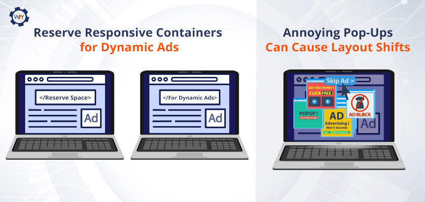 Talk to the publisher and make sure that they style their ad to fit your container, but this does come with some drawbacks. It is possible to have negative space on your website in some scenarios as ads are loaded in. So you can avoid all that by placing dynamic ads lower than the starting viewport, like somewhere in the middle or preferably towards the footer.
There are other instances besides dynamic ads.
Annoying interstitials like pop-ups to sign up for a newsletter or promotion of products and services or pop-ups that prevent the user from navigating can cause a layout shift. Besides, these intrusive page experiences can be annoying to the end-user.
Again, reserve space for these interstitials, but keep in mind that Google has guidelines for interstitials and sites that need them for necessary, legal, or explicit reasons (e.g., age verification blockers, cookie consent, etc.) should use them but correctly. So really gauge how essential they are for the user's experience.
On that note, what about embeds and iframes?
Make Space for Embeds and Iframes
At some point in your life, while surfing online, you've seen a YouTube video embedded on a website, a Google Maps location on a bakery's website and even the tweet that we've embedded near the top of this blog post.They are all embeddable widgets and they can be in the form of an inline HTML snippet of code, a JavaScript tag, an HTML fallback element (placeholder) that turns into web content using JavaScript code and an iframe embed too.
Sometimes these embeddable widgets can cause layout shifts because they don't always serve the right amount of space as is and the same goes for online pages that might not reserve enough space for them either. On top of that, you have to account for responsive design to accommodate varying screen sizes for different devices.
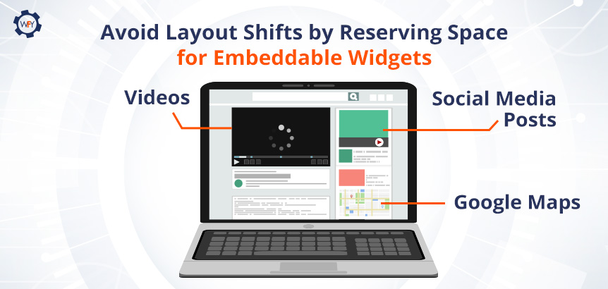 One approach to solving this is to reserve enough space with a
 div container for these widgets, iframes, or ads and define them within your HTML and CSS files so you can then create a tag for it using JavaScript, if necessary, or for repeat scenarios.You can also place a fallback image or use a placeholder and precompute enough space for your embeds using media queries. A media query uses a "true" or "false" Boolean expression. By setting media queries up in your site's code for
embed or iframes, you can dictate how these elements are displayed to the end-user in various dimensions and positions depending on the device and its orientation.We've discussed the various instances where media such as dynamic image ads or videos can cause layout shifts that negatively impact your CLS score, but what about web fonts that cause shifts?
Avoiding FOUT or FOIT
Here's some food for thought. Oliver Reichenstein once said in a 2006 blog post that 95% of web design is typography because 95% of the information on the web is in a written language.As a brand, your choice of font is crucial for brand recognition, the readability of your content and can have an impact on your site's performance.
For many years, all web browsers have had their own set of default fonts that are considered "web-safe fonts" if you choose not to load your own web fonts on your own server. They're safe because there's no network request needed to fetch your font, and they won't cause these two layout shift issues below.
Flash of Unstyled Text (FOUT) is when your preferred font gets swapped out with another font because the browser couldn't fetch yours in time. To avoid this, some people choose a few fonts to put in their CSS file that closely resembles their preferred font or an alternative font using
block and swap CSS properties in case someone is using an older browser.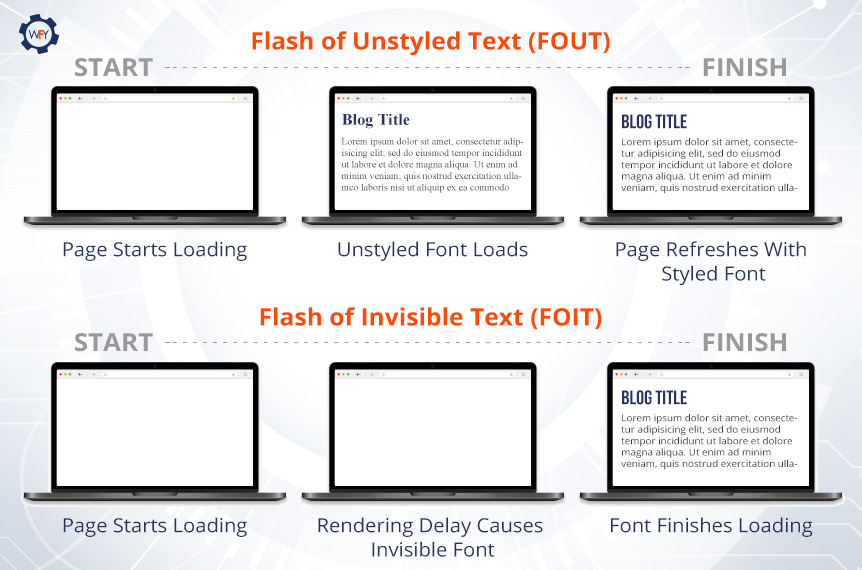 Flash of Invisible Text (FOIT) occurs under similar circumstances, but instead of a default font being loaded by the browser, your font won't load and the text area will look invisible until the browser completes the network request to get your font of choice displayed.
There are four things you should keep in mind to avoid FOUT and FOIT from occurring. Let's dive into it so you can avoid an unnecessarily poor user experience because of web fonts.
Self-Hosting Fonts
First, you should always self-host your fonts or host them on a CDN because performance is your number one priority when it comes to caching fonts.In October 2020, Chrome started to disable the caching of fonts for website visitors and Safari has long disallowed (2013) the caching of fonts for security reasons.
Here's how font caching works at the time when it was allowed.
Visitors would go to a website that used the "Roboto" font, and if they were to visit another site with the same font, it'd load faster the next time because the browser already cached it. This isn't the case anymore and Google has been suggesting to self-host your fonts since their "Web Performance Made Easy: Google I/O 2018 article."
There are advantages and disadvantages to self-hosting or using a CDN for your own web fonts.
Advantages are personalized branding, not relying on third-party services, you have full control over caching, fewer network requests for faster load times, and if you're site's using HTTP/2 technology, you can take advantage of fewer requests needed by the browser.
Disadvantages are longer download times if your font files aren't optimized, which we'll get into, and you have to be careful about only using newer font formats like WOFF2 because older browsers may not support them and will return web-safe fonts that may not be on-brand. Lastly, it could be too complex for the average person to set up newer font styles resorting you to use web-safe fonts.
If you're dedicated to having fonts with style, then here's what you can do to optimize self-hosting them and how they cache. Host that font with a CDN, and using JavaScript, you can run a script to tell the browser's cache control in the HTTP header that this font is never going to change with the
immutable property.This is optional, but you can also set the duration of how long your font will be cached for the browser using the
max-age property and set it to a year like this, max-age="31536000" because browsers mandatorily have to recache your content for freshness.Preloading Fonts
We talked about preloading techniques for images and other resources, but fonts are actually one of the last things to load and cache in the browser.If you want to improve your Time to Interact, First Contentful Paint and Cumulative Layout Shift Score, then preloading fonts is a possibility and it's the second tip to follow. Check out that link for an idea on how to do it so you can avoid FOIT and FOUT issues.
Our third tip is related to limiting the amount of work browsers need to perform when it comes to network requests.
Font Display, Variable Font Files and Subsetting
What are variable fonts?Variable fonts allow you to combine multiple weights and styles into one font file. By doing this, you're reducing the number of network requests that the browser has to make. You can load variable fonts in your CSS through the
@font-face rule and feel free to visit Google's variable font tutorial here.Most sets of font files can be written in multiple languages or contain different special characters, which increases the file size. So subsetting your font files allows you to remove the font files with styles that you don't need to only what you're using.
If you'd like to save on file size, then we highly recommend you visit this creating font subset tutorial where they'll go over how you can do it yourself, and they provide some online tools that enable you to create subsets for your web fonts easily.
On to the fourth and last tip, that's pretty simple, and you can apply it to your CSS files for your fonts. First, find a font that closely resembles your preferred font and add it to the
font-family CSS value. Next, use the font-display property to change the rendering method of your font by adding the optional value.If you set this CSS value for your font, and its backup, and preload them as discussed above, you're telling the browser that these fonts have priority and if it fails to render the first font, it'll load the second one within milliseconds. The user may not even notice that a FOUT ever occurred, and thus, your CLS score won't be affected nor the user's experience.
Shifts Aren't Always Bad When Users Expect It
Sometimes layout shifts aren't necessarily a bad thing when the user expects it but when they don't, it can set the tone for a poor user experience. It's ok for a user to experience a layout shift when it occurs to a response that the user made on your website.For example, a user clicks a button that sends a network request to process a payment. It's ok if the user sees something happening in between to make it obvious that things are about to shift, so if the user sees an animated loading bar that says, "Processing Your Payment," that's totally fine.
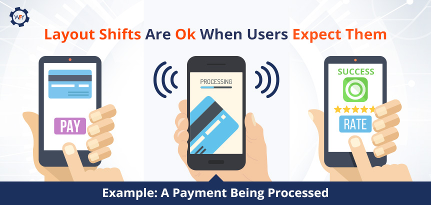 If the user weren't able to see that, then they might click out or click something else because it wasn't obvious to the end-user.
CLS is a ranking factor and can affect SEO, but it doesn't carry as much weight compared to the other two metrics; however, you might as well strive to score greens in all 3 (really 6) metrics come June 2021.
Get Under The Hood of Your Website Using Developer Tools
With the Lighthouse 6.0 and above versions, you can measure and debug what's causing a layout shift on your site in the lab data set, not the field data set. You can also see highlighted DOM nodes that may be causing the shifts in your layout.For Chrome browser versions 84 and above, the performance panel in the DevTools shows layout shifts in the experience section and you can see a summary view, your CLS score and a rectangle overlay showing any affected regions on your website.
 If you have a basic grasp on SQL, then learn how you can see real-world data by visiting this tutorial on using the CrUX Report on BigQuery and you can see monthly snapshots of how users experience your site in all three CWV metrics.
With the PageSpeed Insights tool, you can see all your scores for each metric in both the lab data view and field data view if there's enough data available and all you have to do is submit your URL.
Websites With WebFindYou Always Score Green
At the technical level, websites with WebFindYou are on a secure SSL certification and built with SEO-optimized code that requires less time to render, display and become interactive.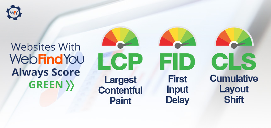 Our kit designs are built to be responsive, ADA compliant, fully customizable upon request, and the ability to load images onto your site and the process to make them responsive is completely streamlined. All you have to do is load them and choose their resolution sizes.
We can't give out our proprietary code but just see for yourself how our homepage scores in each Core Web Vitals metric. Those scores are mirrored across every one of our websites with WebFindYou.
On top of that, we've reduced the SEO work required to set up your site on the technical level by 50%. As long as those with WebFindYou follow Google's "E-A-T" acronym and produce the best content and experience possible, then they shouldn't have anything to worry about. Our technology guides you on your content creation and what types you should be developing to maximize brand awareness, leads and sales.
The update is no sweat on our backs, and if Google, Bing or even social media platforms require changes to websites with WebFindYou for maximum visibility and results, we'll auto-update them and notify those of any other manual changes they'll need to make.
Learn more about our All-in-One Digital Marketing Technology so that you can unleash the power of the Internet in a simple yet affordable way.
Google's Vision for a Better Web Experience
We know this post was a long one to digest, but Google and their development team aim to create a better web surfing experience. They're ensuring that websites follow the page experience guidelines that they have made a standard, and on top of that, they want websites to perform better per the Core Web Vitals' metrics.They've given us the tools to enhance our websites, and we encourage you to stay abreast of all the modern developments that'll be rolling out throughout the years to come. Content creators know that they have to produce quality content with the searcher's intent in mind while following the "E-A-T" concept. And web developers need to know that they have to look under the hood of their website's code occasionally to make it perform better each time there's a change to be made.
Expect more and more changes to Google's algorithms as they launch new ones every few months to serve a better web experience for all.
Portions of this page are modifications based on work created and shared by Google and used according to terms described in the Creative Commons 4.0 Attribution License.
Want to read this in Spanish? Spanish Version >>


